 In the Display area, you can create the interface of the portals which are available in the Portal management area. Some themes for interfaces exist as example and you can customize them. Alternatively, you can create your custom theme.
 In the Display area, you can create the interface of the portals which are available in the Portal management area. Some themes for interfaces exist as example and you can customize them. Alternatively, you can create your custom theme.
The existing themes are displayed in the left pane. Click on one theme. In the right pane, you can now see the design that has been defined in this theme.
After clicking on one element in the display or after selecting it from the Element drop-down list, you can change the look of the element with the buttons or icons.
 New theme opens the corresponding window. Enter a name under which you want to create a new theme.
 Activate activates the selected theme. This theme is now used by CAS genesisWorld users.
 Delete deletes the selected theme.
 Change banner/
 Change logo opens the file selection window. Select the desired file for the banner (left) or the logo (right). Supported file formats are GIF, JPEG and PNG.
 Company name: enter the name of your company or your company's Intranet name. In the portal the name of the logged-on user is automatically shown under the company name.
 Menu opens a window showing various templates. You can change the background colors of the Main category and the Main category (active) in the templates in which a color has not yet been specified.
Please note when setting the font size that the height of the menu is fixed. If the font is too large, you might not be able to see all the text.
Element: this drop-down list contains all elements of the theme whose appearance you are allowed to change. Select an element and the corresponding buttons and icons will be activated automatically.
Font, Font size, Font style (bold, italic, underlined), Font color: these buttons allow you to change the properties of texts.
Background: clicking this button opens the Windows color settings window so that you can change the background color.
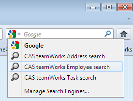
Click the Change search settings button to change the search settings for users in the navigator. Once you have set up this search, users will be able to select a search plug-in for selected data record types. This allows users to search for data records of these data records types using the browser's search field. Users can also select the search plug-in via the settings in the portal.
Only 2 plug-ins can be set for the Internet Explorer browser; there is no limitation on the number of plug-ins for Firefox.
 Click Search several components. Select the data record types that are to be searched.
A component must be available for each selected data record type. If more than one component is available for a data record type in the portal, then the default component is used.
During a search, the system accesses this component and displays the search results. If change the default component, you also change the list for the search and the list of results.
Users can activate Add search plug-in for the selected data record types. Users can then search for this data record type using the browser's search field.