You can use this element to display data that is not stored in CAS genesisWorld, for example, a Microsoft Excel list with company terminology or product information of a Microsoft SQL database.
The element displays a list with fields. The data cannot be changed.
In order to display this element, the administrator must set up an external data source in the Management Console.
The Aggregated view element displays a summary of certain data records belonging to a data record type.
The Aggregated view of linked data records displays a summary of linked data records of a data record type for the data records of a data record type that the user has selected.
Below are the steps for creating an Aggregated view. The steps for creating an Aggregated view of linked data records are principally the same. Whereby you select specific links to a certain data record type.
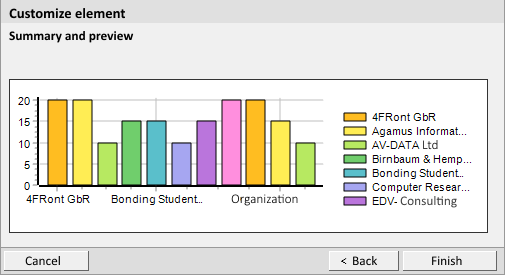
The following example will show you how to create this element. The element shows customer discount for each company.
Enter, for example, Discount per company as in the heading.
For the data record type select Addresses.
With these addresses, you set the Category field to Customer and the Turnover field to greater than 0. In the third row, select only those customers who have a discount of more than 5%.
Select Company.
If you activate Number of data records, the element will then display the number of data records for each category.
If you select Sum, Minimum or Maximum, then also select Calculated values. In the Calculated values field you can only enter data record fields that contain numbers. The element then displays the sum, maximum or minimum for each calculated value.
For the sake of the example, select Maximum and Discount for the Calculated values field.
If you want to display data in the form of an RAG rating, you can choose the range of values each of the colors red, amber and green should represent. The colors result form the aggregate function.
If you wish to display a diagram, you will also have to enter the size. Additionally, for diagrams you will also have to set the Color scheme and define whether a Key should also be displayed.
For our example select Horizontal bar chart.
The section of the chart you have selected is highlighted in blue. The element is also highlighted with the same color in the legend.